Most scientists would agree that nothing livens up a technical presentation like colorful images and cool graphics. But, more importantly, they can make the relevance and meaning of information instantly accessible.
ColorMoves is a brand new graphics tool—created by Francesca Samsel of the University of Texas at Austin, Sebastian Klaassen of the University of Vienna, and David H. Rogers of the Scale Team at Los Alamos National Laboratory—that allows scientists to tap into their artistic side through an interactive, exploratory interface for scientific visualization.
One important feature of the tool is how fast it is, and how that speed “fundamentally changes a scientist’s interaction with data and color,” they say.
Watch video of Francesca Samsel’s work pertaining to the 2011 Fukushima Tsunami, Japan’s history of nuclear disasters and the danger of living on the Ring of Fire.
The authors of “ColorMoves: Real-time Interactive Colormap Construction for Scientific Visualization” (login required for full text) explain how color and color-mapping options are critical aspects of scientific data exploration, allowing questions and answers to emerge.
“For extreme data sizes such as those being generated on today’s largest supercomputers, there is a need for tools that allow interactive exploration of data,” they say.
ColorMoves does just that.
As an interface that enables scientists to construct colormaps with contrast applied to regions of greatest interest, it also promotes interactive exploration of data through color. The ability to load several images into the interface window enables scientists to construct colormaps that are effective across time ranges, camera views, variables and more.
How ColorMoves works
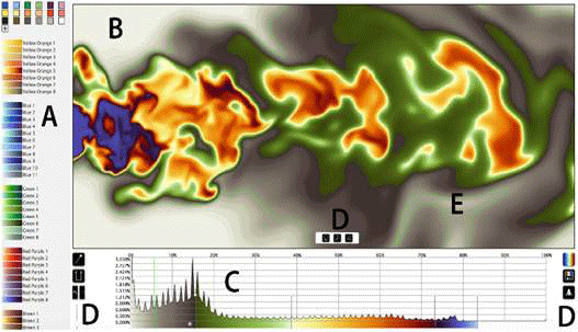
Below is a picture of the ColorMoves user interface.
- A: selection menu of color scales and discrete colors
- B: viewing window
- C: data distribution histogram
- D: (left) pin splitter, color scale inserter, undo, redo, number of histogram bins
- D. (right): color menu, export, opacity controls
- D: (center) save, fit to screen, resize to original
- E: histogram pin location highlight.
ColorMoves in action
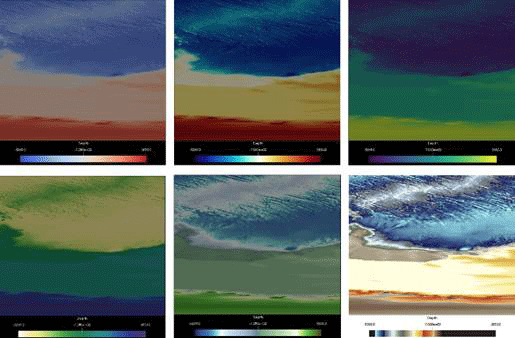
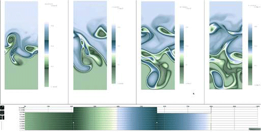
Below is a simulation of an ocean system shown in the ColorMoves interface.
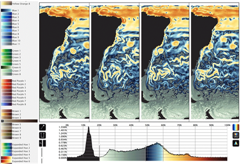
Here, four different data sets are compared using the rainbow colormap and a colormap with a more-muted palette. The muted palette is clearly the better of the two.
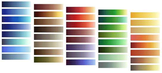
ColorMoves provides a wide range of color scales varying in hue, saturation, and value. These provide the building blocks needed to create focused attention, hierarchy of interest, categorical and intuitive association, as well as communicative visualization.
Here is an atmospheric simulation from Pacific Northwest National Laboratory rendered in six colormaps. The lower right version illustrates how the ability to control the luminance distribution is critical to optimizing discriminatory power.
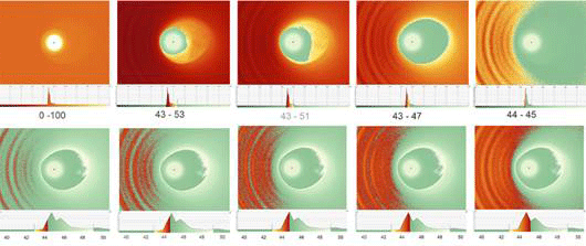
Below are multiple images of the Ganymede magnetic field simulation from William Daughton, Los Alamos National Laboratory.
On the top left, the red-to-yellow color scale spans the full data range. Moving right, the red-yellow color scale decreases down to spanning only one percent of the data range. By narrowing the span of the color scale, the bowfront waves come into focus. The bottom row narrows in on the precise applied range that most clearly presents the bowfront features.
The opacity of the individual color scales is being adjusted in this baroclinic MPAS-Ocean data in a time-varying sequence in order to control the emphasis while maintaining a continuity of hues.
Neutron spectroscopy data often has features of interest on many orders of magnitude of intensity. ColorMoves allowed for a custom color map to emphasize the intensity variation. The ease of adjusting the color encoding makes identifying features of interest in the data much faster.

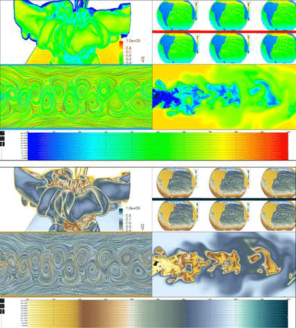
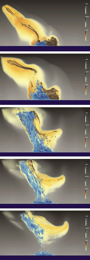
A time-varying simulation of a 250-meter asteroid impact in the ocean, rendered with a colormap developed in ColorMoves. The variables are the water fraction (blue), asteroid fraction (brown), and temperature (orange to yellow).
The ColorMoves code, color scales and supporting material can be found on GitHub.
Related research on data visualization in the Computer Society Digital Library
Login may be required for full text.

About Lori Cameron
Lori Cameron is a Senior Writer for the IEEE Computer Society and currently writes regular features for Computer magazine, Computing Edge, and the Computing Now and Magazine Roundup websites. Contact her at l.cameron@computer.org. Follow her on LinkedIn.