It sounds unnerving, but what if your cardiologist could reach into your chest, pull out your heart, examine it, and put it back—all without killing you or even doing surgery.
Well, researchers are developing something like that already.
It’s called 4D flow visualization, and it allows doctors to take a three-dimensional MRI of your heart—then view and penetrate the whole image instantly (that’s the 4th-dimensional part) to get a clearer picture of your heart’s condition and blood flow—all important in battling how heart disease is the No. 1 killer.
Now, Swedish researchers have taken this technology one step further by putting a stylus in the hand of your doctor, so he or she can “touch” your heart virtually, examining the chambers, arteries, and blood flow, all in a bid to identify your heart problem.
The new tech applies “haptics”—or touch—technology to a 4D interface, and it’s the latest in research to improve heart disease diagnosis.
“We show how data exploration and analysis can be further improved by adding haptics—force feedback that represents, and is derived from, the data. This combination of sensory information input leads to the notion of visuo-haptic visualization,” say Linköping University’s Rickard Englund, Karljohan Lundin Palmerius, Ingrid Hotz, and Anders Ynnerman, authors of “Touching Data: Enhancing Visual Exploration of Flow Data with Haptics” in the May/June 2018 issue of Computing in Science & Engineering. (login may be required for full text)
Haptics allow users to “touch” items in a virtual environment in a realistic, highly-sensory way. The researchers chose “The Touch” developed by 3D Systems to use with their flow visualization system, not only to see the heart from numerous angles and perspectives, but to “feel” the parts of the heart they can’t see.
“In visuo-haptic visualization, the visual rendering is enhanced with haptic feedback to provide an additional channel of information, intuitive representation of non-visual data and physical guidance of exploration,” they say.
You can see how The Touch works in the video below.
An artist demonstrates how to use The Touch in creating sculptures.
The old method of analyzing an MRI—which is a scan of part of your body through magnetic resonance imaging—involves the examination of numerous sliced images, much like rifling through a huge deck of cards. It’s time-consuming and offers less-than-ideal analysis of actual blood flow.
Combining 4D flow analysis and haptics changes the game considerably.
“An intuitive visualization is challenging since pathlines imply a temporal summary of the flow, and thus, the temporal context and the geometric embedding get easily lost. Adding haptics to the exploration of pathlines provides a new means to navigate through time and bridge this gap,” the authors say.
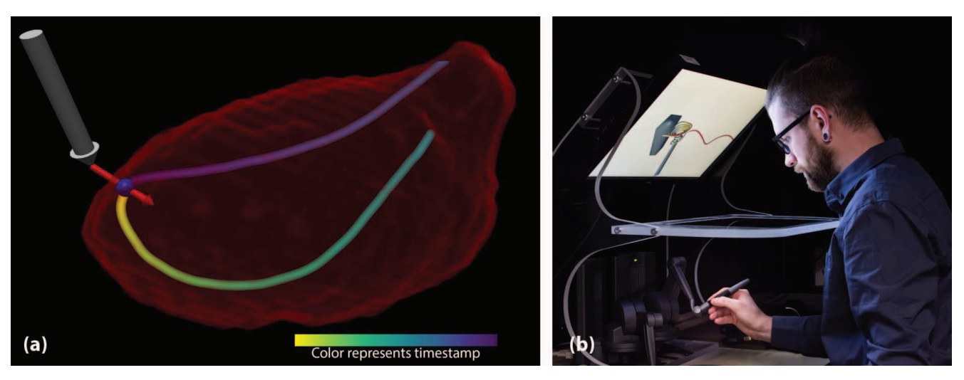
How The Touch system works with 4D flow visualization
The image above shows exploration of cardiac-flow dynamics in the human heart. The left ventricle of the heart (a) is shown with one multi-colored flow pathline.
Using a stylus, a user (b) can trace the pathline, shown as a gray arrow, using force feedback (the pressure you feel when coming in contact with a virtual object). The visuo-haptic system matches the haptic device with its visual representation on the screen.
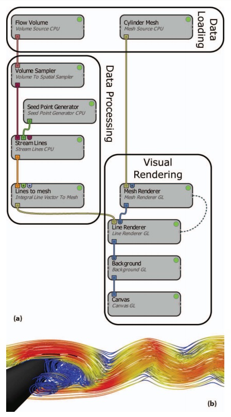
An Inviwo (an extendable C++ framework for easy prototyping of interactive applications) network is used to capture images of flow around a cuboid (shown in black). The network consists of several parts:
- A data-loading part, in which the cuboid mesh and a volumetric dataset describing flow around the cuboid are loaded.
- A data-processing part, where seed points are generated and streamlines are integrated through the field from the seed points.
- And a visual-rendering part, which renders the streamlines as tubes around the cuboid.
The final image (b) shows colorful streamlines that represent the velocity magnitude.
The illustration below shows a processor network (a) that combines haptics and visual rendering. The Inviwo network explores the flow around a black cuboid.

The result is a visual representation (b) of the haptic interface (gray arrow), which is being pulled towards the haptic proxy position shown in the blue sphere. A red arrow shows the force applied to the haptic interface.
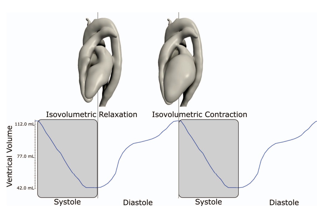
The cardiac cycle illustrated above provides an important temporal context for blood flow analysis.
The image shows the ventricle volume during two heartbeats together with the shape of the heart when it relaxes and contracts—that is, the volume of blood in the ventricles at its smallest and largest.
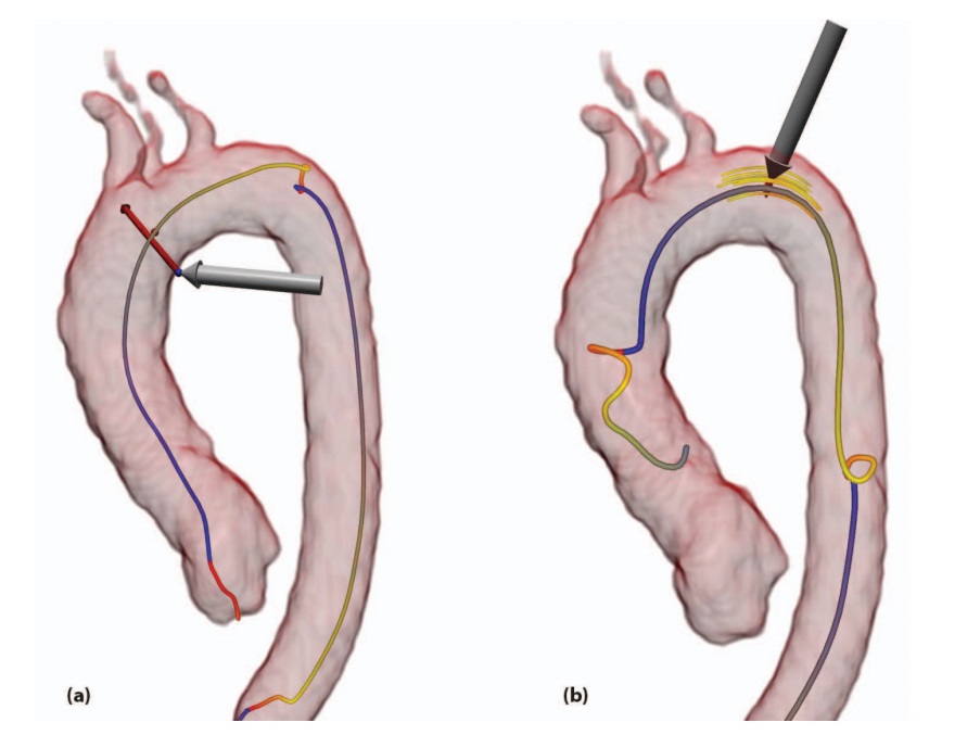
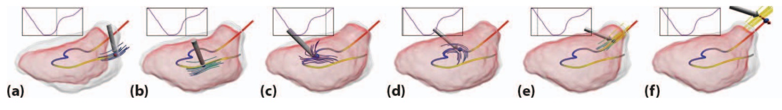
Above are examples of the “line follow mode” while exploring pathlines in the aorta.
The gray arrow (a) represents the location and orientation of the haptic interface and the red arrow represents the amount of force. The field around the haptic interface (b) is shown with short streamlines.
Blood flow is highly complex, as illustrated below.
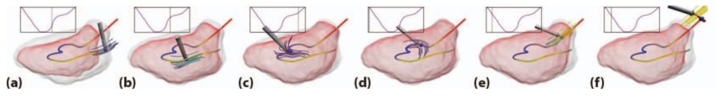
From left to right, the heart geometry changes when moving the haptic interface along the pathline, starting in the early diastole (or ventricular filling) and ending in the mid systole (or ventricular contraction).
In each image, the current geometry is shown as a red surface and the bounding geometry of all time steps as a gray surface for context. The current vector field in the vicinity of the haptic interface is highlighted using short streamlines.
Exploration begins at the mitral valve (a) and moves into the ventricle during the diastole (b) and (c). The heart expands, as more blood is pushed into the ventricle, reaching a maximum (d), the isovolumetric contraction.
In (e), systole begins where the ventricle contracts and pushes the blood out of the ventricle into the aorta through the aortic valve. The pathline reaches its maximum velocity in (f), where it has just left the ventricle and enters the aorta.
Pathlines of the heart
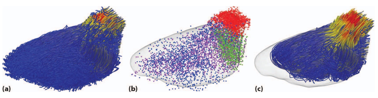
Because of “noise” in the measured flow, invalid pathlines must be filtered out. This is done by evaluating the pathline’s entry and exit points.
In the above illustration, all of the pathlines are seeded in each voxel (a) in the left ventricle during iso-volumetric contraction.
In (b), red and blue represent valid and invalid exit points, respectively, while green and purple represent valid and invalid entry points, respectively.
After discarding invalid pathlines, the valid pathlines (c) remain. These lines enter through the mitral valve, traverse the ventricle, and exit into the aorta through the semi-lunar valves.
All of these illustrations show, not only the same detail that standard MRI analyses show, but also how much faster and more accurate the proposed interface can be.
According to the researchers, their work demonstrates “how data exploration can benefit from adding haptic representations in the visualization work flow. In the case of blood flow analysis of a beating heart, haptics not only enhance the augmented visual images, it also adds new modes of exploration. The navigation along pathlines adds time as a new dimension to the exploration space and renders the concept of pathlines more graspable.”
However, the authors caution that their application uses only a limited set of possible haptics modes.
“It is clear that haptic data exploration has much to offer, and further work is needed to explore its potential,” they say.
Research related to haptics in the Computer Society Digital Library:
(login may be required for full text)

About Lori Cameron
Lori Cameron is a Senior Writer for the IEEE Computer Society and currently writes regular features for Computer magazine, Computing Edge, and the Computing Now and Magazine Roundup websites. Contact her at l.cameron@computer.org. Follow her on LinkedIn.